Fundamentals of Design Principles
There are a huge variety of design principles that are included as basics, such as Gestalt Principles, Typography, Color, and more.
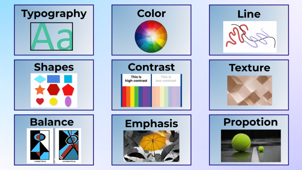
1.Typography
Typography refers to the method of arranging text in design, including font style, size, and space. Proper typography enhances readability and communicates the design’s tone effectively. Tools like Google Fonts, Adobe Fonts, and Font Squirrel offer a variety of fonts to enhance your design.
2.Color
Color plays a significant role in design, where color psychology attracts viewers. The color wheel offers a variety of shades to choose from, allowing designers to create compelling visuals. Use resources like Adobe Color and Canva to find color combinations that suit your project.
3.Line
A fundamental design element, lines can be used to define space, create forms, and guide the viewer’s eye through the design. Lines add structure and direct attention to key parts of the design. They also help create visually appealing patterns and layouts.
4.Shapes
Shapes, whether geometric or organic, evoke feelings that are directly related to design. They are a major part of any design and add depth and interest to the composition. Shapes are vital in creating structure and organization within the layout.
5.Contrast
Contrast emphasizes the difference between elements such as color, size, or type. It enhances visual hierarchy by drawing attention to specific components like text or graphics. Using the right contrast can make your design pop and capture attention instantly
6.Texture
The texture of a design refers to its perceived surface quality. It adds depth and enhances the sensory experience. Texture can be used in stock imagery or patterns to give designs a more tactile feel.
7.Balance
Balance is about arranging elements according to their visual weight. There are two types of balance: symmetrical and asymmetrical. Symmetrical balance places equal weight on either side of the centre line, while asymmetrical balance uses unequal elements to create visual harmony. Balance can be achieved using Adobe Creative Suite tools like Illustrator and Photoshop.
8.Emphasis
Emphasis highlights the crucial information the design wants to convey. It is used to focus the viewer’s attention on the most important parts of the design, such as a call-to-action or a brand logo.
9.Proportion
Proportion is about placing elements based on their importance. The element that holds more weight, such as the main graphic or text, should be larger to convey its significance.
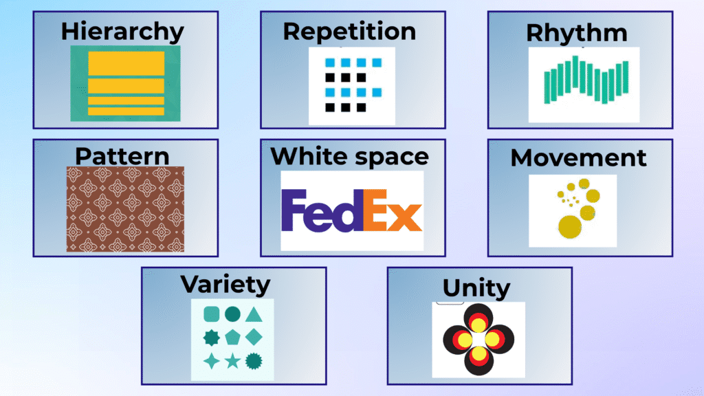
10.Hierarchy
Hierarchy arranges content to make it easier for viewers to access it. By using titles and headings, you create a visual order that guides the viewer through the design. Tools like Figma and Sketch are great for web design, helping you structure content effectively.
11.Repetition
Repetition involves repeating certain elements, such as color or shapes, to establish consistency and a relationship between different parts of the design. Tools like InVision and Zeplin allow you to showcase repetitive elements and make sure they are aligned across your project.
12.Rhythm
Rhythm refers to the space between repeating elements that create a sense of flow. It can be random, regular, alternating, flowing, or progressive, depending on the layout you choose. Patterns created using shapes and lines can add rhythm to your design.
13.Pattern
Pattern is created by repeating design elements, such as colors, shapes, or lines. You can use tools like Canva or Shutterstock for ready-made patterns to integrate into your designs, especially in backgrounds.
14.White space
White space (or negative space) is the area around and between design elements. It helps define importance, create separation, and achieve a sense of lightness and clarity. Using Google Fonts or Adobe Fonts can help you optimize space around text for better readability.
15.Movement
Movement refers to how the design guides the viewer’s eye through the layout. The most important elements should be strategically placed to attract attention first, followed by the less important elements.
16.Variety
Variety creates interest in a design. By using color, typography, images, and shapes, you introduce diversity that pleases the viewer. Variety keeps your design engaging and ensures it doesn’t feel monotonous.
17.Unity
Unity involves arranging elements in a way that they look well-organized and work together in a design. A unified design feels cohesive and professional. When using tools like Adobe XD or CorelDRAW, make sure that all the elements are harmonized to maintain high quality.
Design Tools and Resources
- Design Software: Canva, Adobe Creative Suite (Photoshop, Illustrator, InDesign), Sketch, Figma, Adobe XD, CorelDRAW.
- Feedback Tools: InVision, Frame.io, Miro, Zeplin for presenting designs and collecting feedback.
- Typography Resources: Google Fonts, Font Squirrel, Adobe Fonts, Behance Typography.
- Stock Imagery and Icons: Shutterstock, Unsplash, Pexels, Canva, Flaticon for stock imagery and icons.
- Collaboration Tools: Slack, Trello, Asana for team collaboration and project management.
- File Management: Dropbox, Google Drive for file sharing and storage

How to Choose the Right Tool?
Consider these essential factors when selecting your design tool:
- Skill Level: As a beginner, start with simple tools like Canva and gradually move to more advanced software such as Photoshop or Illustrator as your skills grow.
- Project Type: Depending on whether you’re designing social media graphics, branding, illustrations, or websites, choose tools that are optimized for those tasks.
- Platform Preference: Ensure the tool works with your system (e.g., Sketch for macOS).
- Budget: Some tools are free (e.g., Canva, Unsplash), while others require a subscription. Consider whether you need premium features or can work with free versions.
By integrating these principles of design and choosing the right design tools, you can create beautiful, professional, and effective designs that communicate your message clearly and creatively.